Análisis de #MuseumWeek 2014#MuseumWeek 2014 in depth
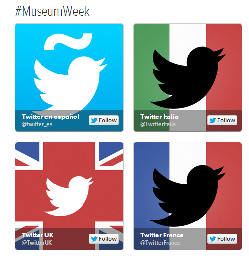 #MuseumWeek es una iniciativa de Twitter arts From March 24-30, museums across Europe will be taking part in the first ever #MuseumWeek. You can follow all participating museums across UK, France, Spain and Italy on these discover pages, and join the conversation by tweeting #MuseumWeek. Se ha realizado un análisis de la primera #MuseumWeek desde tres enfoques, el primero desde las métricas que proporciona la herramienta t-hoarder, el segundo utilizando el análisis de redes con la herramienta gephi y el tercero observando su evolución espacio-temporal mediante un mapa realizado con cartodb: Podemos concluir que:
#MuseumWeek Support byTwitter arts From March 24-30, museums across Europe took part in the first ever #MuseumWeek. You can follow all Participating museums across UK, France, Spain and Italy on these discover pages, and join the conversation by tweeting #MuseumWeek We have done an analysis of the first #MuseumWeek from three approaches, the first from the metrics provided by the t-hoarder tool, the second using network analysis with Gephi tool and the third showing a space-time spread made with a map cartodb We can conclude that:
- Fue un evento institucional, en el que predomino la difusión de información frente al dialogo
- El idioma fue una barrera para establecer una conversación global y dio lugar a comunidades muy diferenciadas
- El poco dialogo que existió se concentró en los museos «latinos» siendo testimonial en los museos ingleses
- La participación se inicio en Reino Unido e Italia de una manera distribuida. En Francia y España fue más tardía y localizada en grandes ciudades
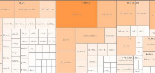
Panel -hoarder
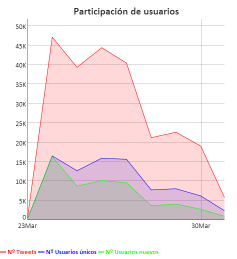
La primera impresión que se recoge en el panel t-hoarder es que fue un evento institucional, como ya indicaba en su artículo @arteinformado
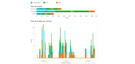
- Casi el doble de participación de usuarios entre semana (~15,000 día) que en fin de semana (~7,000 día), lo que permite sospechar que los animadores eran profesionales
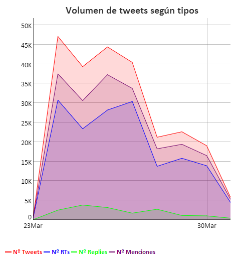
- Muchos más RTs (~30,000 RTs – ~15,000 RTs día) que replies (~3,800 replies – ~1,100 replies día), indican que se trabajó más la difusión que el diálogo
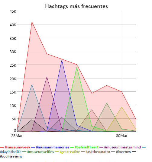
- Disciplina férrea de hashtags, cada día su hahstag, sin salirse del guión
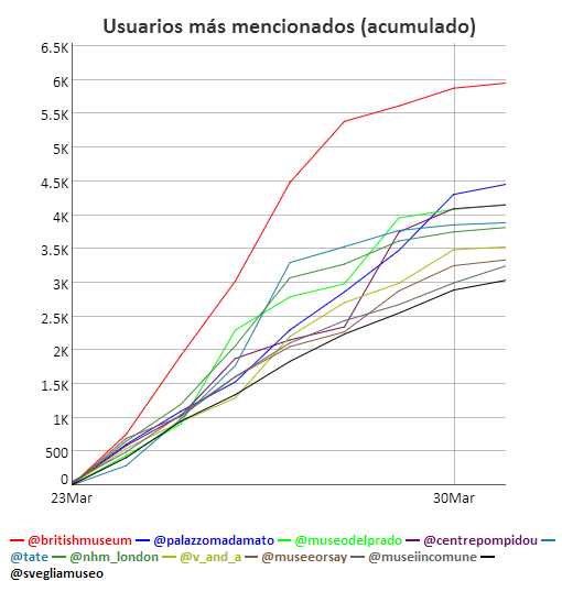
Respecto a propagación de mensajes, una gran parte de los tweets más difundidos fueron escritos en inglés y la mayoría contenía fotos muy atractivas. En cuanto a la mención a perfiles twitter, los ingleses colocaron cuatro de sus museos en el top de menciones, seguidos por los museos italianos que situaron tres. Respecto a España, @muesodelprado quedó en tercer lugar, empatado con el @centropompidou.
 |
 |
 |
 |
Análisis de redes
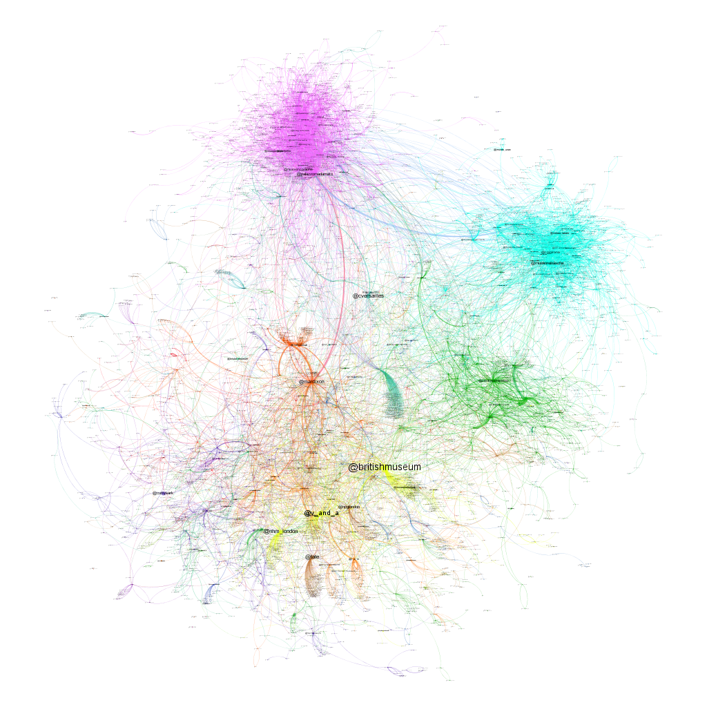
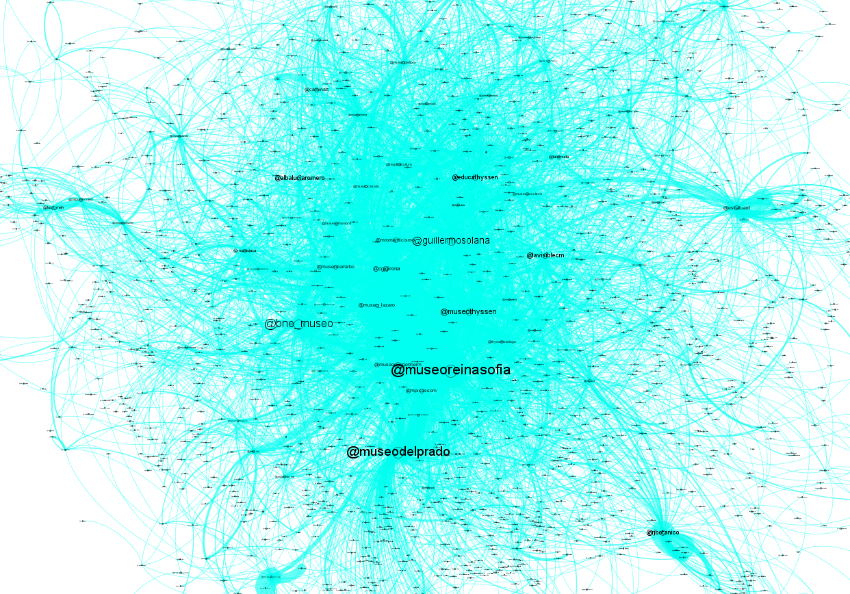
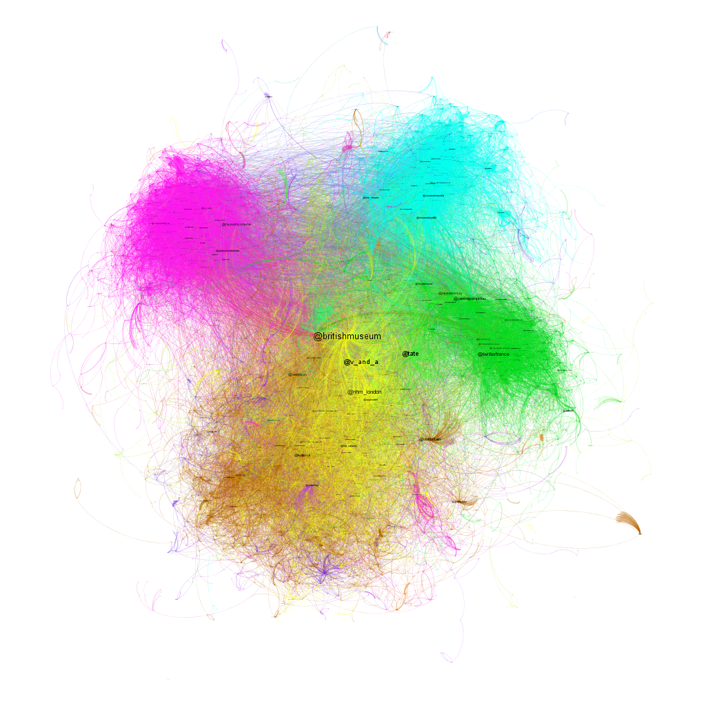
Se ha construido dos redes, una de los replies realizados y otra de los RTs. En ambas redes, para evitar ruido, se han eliminado los usuarios bots @museumweekbot y @museumweekbotuk. La red está formada por los nodos que son los usuarios y por los enlaces que son las relaciones entre ellos, en un caso el reply de un usuario a otro y en otro el retuit. Cada nodo esta identificado con una etiqueta que se corresponde con el nombre de la cuenta twitter y un color. El tamaño de la etiqueta es proporcional al «PageRange» del nodo en la red y el color indica la comunidad a la que pertenece.
Mapa de conversación
En número de replies no llegó al 10% de los mensajes, no obstante la conversación existió y se concentró en los museos latinos, siendo los italianos los más conversadores, seguidos por los españoles y finalmente por los franceses. La conversación de los museos ingleses fue testimonial. La siguiente imagen muestra tanto el grafo global como el detalle por países. Se puede observar que los usuarios se agruparon por países (o por idioma) formando comunidades poco conectadas entre sí. La intensidad de la conversación queda representada por la densidad de las conexiones, mientras que el tamaño de las etiquetas es proporcional a la importancia del nodo en la red.
| (Haga click en las imágenes para agrandarlas) | ||
Italia 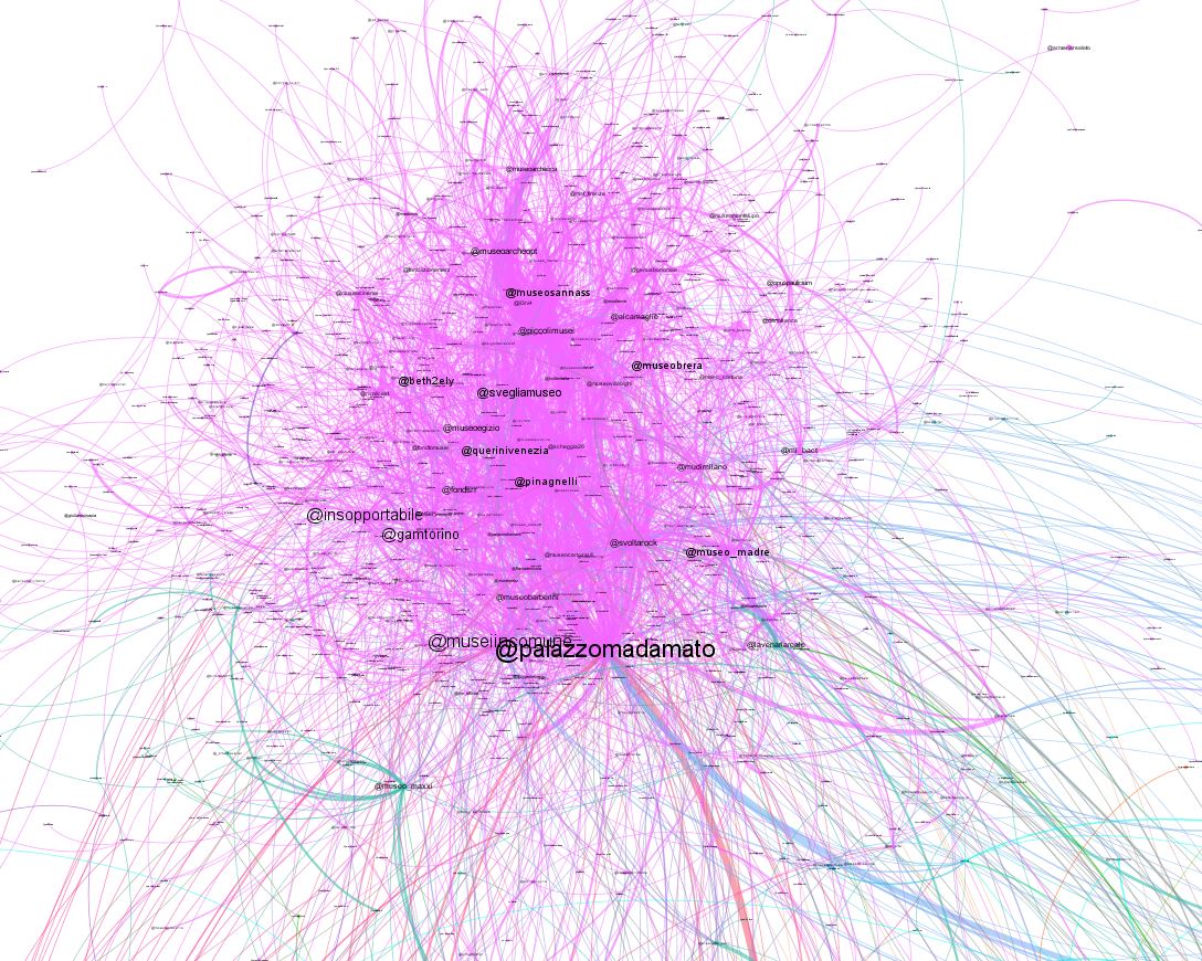 |
España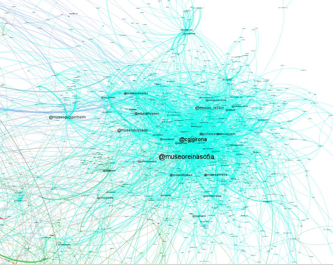 |
Francia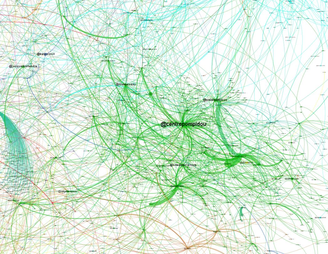 |
 |
||
Mapa de difusión
Más del 60% de los mensajes fueron RTs, siendo la comunidad anglosajona la más activa (37,58%), seguida de Italia (13,57%), en tercer lugar España (12,45%) y en cuarto Francia (12,02%). El resto de las comunidades detectadas están más difuminadas. Al igual que en el caso anterior, la siguiente imagen muestra tanto el grafo global como el detalle por países. En este caso se aprecia un grafo mucho más denso con comunidades muy marcadas y más conectadas que en el mapa de conversaciones. De la misma manera las comunidades se formaron por países (o por idioma), siendo los nodos más destacados en algunos casos diferentes al del mapa de conversaciones. Nota: el grafo de RTs dado su gran tamaño (mas de 50.000 nodos) no era posible generarlo con la herramienta gephi y se ha podado eliminando a los usuarios menos activos. El grafo que aparece a continuación consta de 15.000 nodos formados por los usuarios más activos y más retuiteados. Esta poda puede que afecte al tamaño de los nodos más destacados, aunque no demasiado ya que el criterio para resaltar los nodos es el «PageRank».
| (Haga click en las imágenes para agrandarlas) | |||
Italia 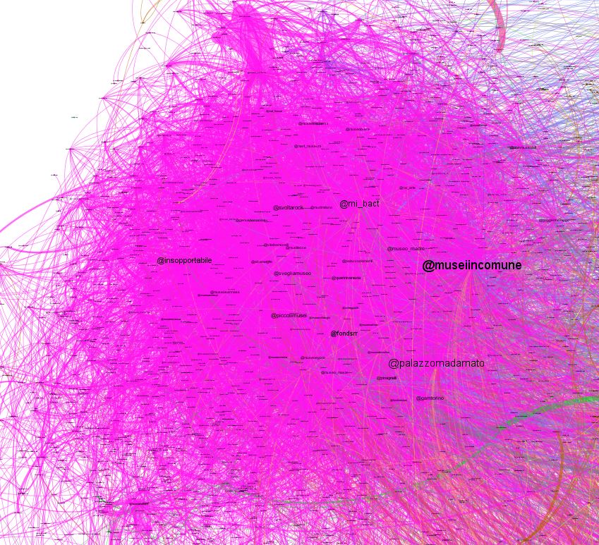 |
 |
Francia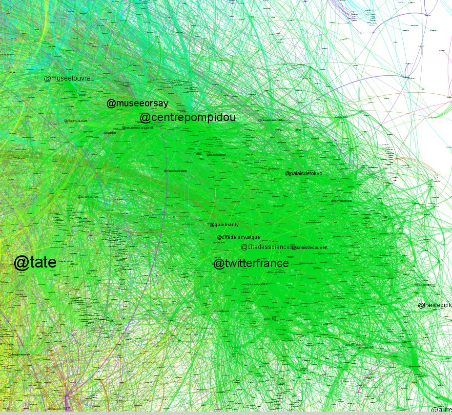 |
Reino Unido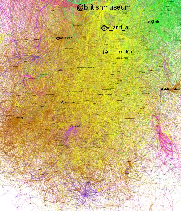 |
 |
|||
Geolocalización
Aproximadamente el porcentaje de tweets geolocalizados suele ser un 1%, a pasar de ser tan bajo este valor es suficiente para darnos una idea de la distribución geográfica de los tweets en el tiempo. Como se puede observar la mayor concentración de tweets se encuentra entre Reino Unido e Italia. Fuera de Europa el país más activo fue Estados Unidos. Los ingleses e italianos fueron los primeros en participar y tuvieron una participación más distribuida, mientras que franceses y españoles se incorporaron más tarde y lo hicieron desde la principales ciudades.
- It was a corporate event, where the dissemination of information exceeded the dialogue
- Language was a barrier to establishing a global conversation and led to very different communities
- The little dialogue that existed was concentrated to the “Latin Museums » being testimonial in English Museums
- Participation began in the UK and Italy in a distributed manner. In France and Spain were in large cities
T-hoarder panel
The first impression from the t-hoarder panel is it was a corporate event, as noted in its Article @arteinformado
- Participation in working days (~15,000 users) was twice that of weekend (~7,000 users), causing suspicions that animators were professional
- There were more RTs (~30,000 – ~15,000 RTs day) than replies (~3,800 – ~1,100 replies day), indicate it was focused on dissemination
- Hashtags were used with discipline, every day had its hashtag
In respect to message spread, the most popular tweets were written in English and contained most of them attractive photos. In the top ten mentions were four British Museums, three Italian, two French and one Spanish. The @muesodelprado was in the third place, tied with the @centropompidou .
|
|
|
|
Network analysis
We have built two networks, one for the replies and another for the RTs. In both networks, to avoid noise, we eliminated the bots @museumweekbot and @museumweekbotuk. The network’s nodes are the users and the links are the relations between them, the reply or RT from one user to another. Each node is identified by a label that corresponds to the Twitter profile and a color. The tag size is proportional to the node «PageRange » in the network and the color indicates the community to which it belongs
Conversation map
The number of replies didn´t reach 10% of the messages, however there was conversation and it was focused on Latino Museums, Italians being the most talkative, followed by the Spanish and finally French. The conversation of the British Museum was testimonial. The following image shows both the overall graph as the country breakdown. We can see that users are grouped by country (or language) forming little connected communities. Conversation intensity is represented by the density of connections, while the size of the labels is proportional to the importance of the node in the network.
| (Haga click en las imágenes para agrandarlas) | ||
| Italia |
España |
Francia |
|
||
Diffusion map
Over 60% of messages were RTs, the Anglo community being the most effective( 37.58% ), followed by Italy ( 13.57% ), thirdly Spain ( 12.45% ) and fourth France (12.02% ). The remaining communities were more blurred. As in the previous case, the following image shows both overall graph as the country breakdown. In this case a much denser graph with more defined and connected communities than in the conversation map. Likewise, communities were formed by countries (or language), the most prominent nodes, in some cases, are different to conversation map. Note: the graph of RTs was a large size (more than 50,000 nodes) it was not possible to generate with the Gephi tool and we pruned it removing the less active users. The graph below contains 15,000 nodes formed by the most active and most retweeted users. This pruning may affect the size of the most prominent nodes, but not too much because we used “PageRank» to highlight the nodes.
| (Haga click en las imágenes para agrandarlas) | |||
| Italia |
|
Francia |
Reino Unido |
|
|||
Geolocation
Approximately geolocated tweets are usually 1%. This sample is enough to give us an idea of the geographical distribution of tweets over time, even though this value is so low. We can see the highest concentration of tweets were in UK and Italy . Outside Europe the most active country was the United States. The British and Italians were the first to participate and had a more distributed participation, while French and Spanish were added later and did so from the main cities.